CURAFIED
A UX audit of a new business concept.
̌
Project Overview
Curafied was looking to revolutionize how Influencers impact social media. Figuring that these entrepreneurs would be tired of hustling to produce content for insufficient corporate payouts on business they generate, Curafied decided to give them an alternative option.
The Curafied web app was born to provide Influencers with a space to make higher profits on the content they work so hard to originate, while also giving audiences and fans more direct, intimate, and personalized access.
Project Scope:
Project Type: UX Audit for Web App Product
Platform: iOS, Windows
Deliverables: User Research Artifacts (Research Plan, Discussion Guide, Synthesized Data, Next Steps Action Items)
Tools: Miro, Coda
My Role:
User Research
UX Design
THE PROBLEM:
As a premise, Curafied was built on the assumptions that: a) social media Influencers are currently unsatisfied with the earnings they receive from corporate business deals, and b) there is a better way that they can earn more directly.
Is there a need or desire for this from Influencers? What about general audiences? How would their reaction to such a product be?
All these questions and more, were considerations Curafied did not test before building their initial MVP. This led to a confusing and ineffective product. Before they proceeded to attempt more funding and further development, they needed to go back to their original concept and reassess its viability.
To avoid further mistakes, Curafied founders and stakeholders decided to conduct a UX analysis of their ideas and first round MVP.
The Solution:
A thorough UX audit on Curafied’s existing business concept, MVP, and existing thoughts about target audience’s behaviors, wants and needs.
research:
Initial Thoughts & Assumptions:
At the beginning, I wrote down some of my initial thoughts and assumptions about Curafied’s product and the problem they were attempting to solve to avoid any preemptive or personal bias. I would be attempting to test these along with stakeholder assumptions as we began the process of user research and testing.
Will Users be confused by Curafied’s payment model?
Will Users want more social media in their lives? Aren’t they striving for less?
Will Curafied be too similiar to Pinterest?
Aren’t Users wary of ads and sponsored content?
Do Users know what a Co-Op is?
Why would Users pay for a subscription service when content is already offered for free?
User Interviews:
Once I had a grasp on my personal biases, it was time to hone in on who to interview to get the most accurate information regarding Curafied’s potential success.
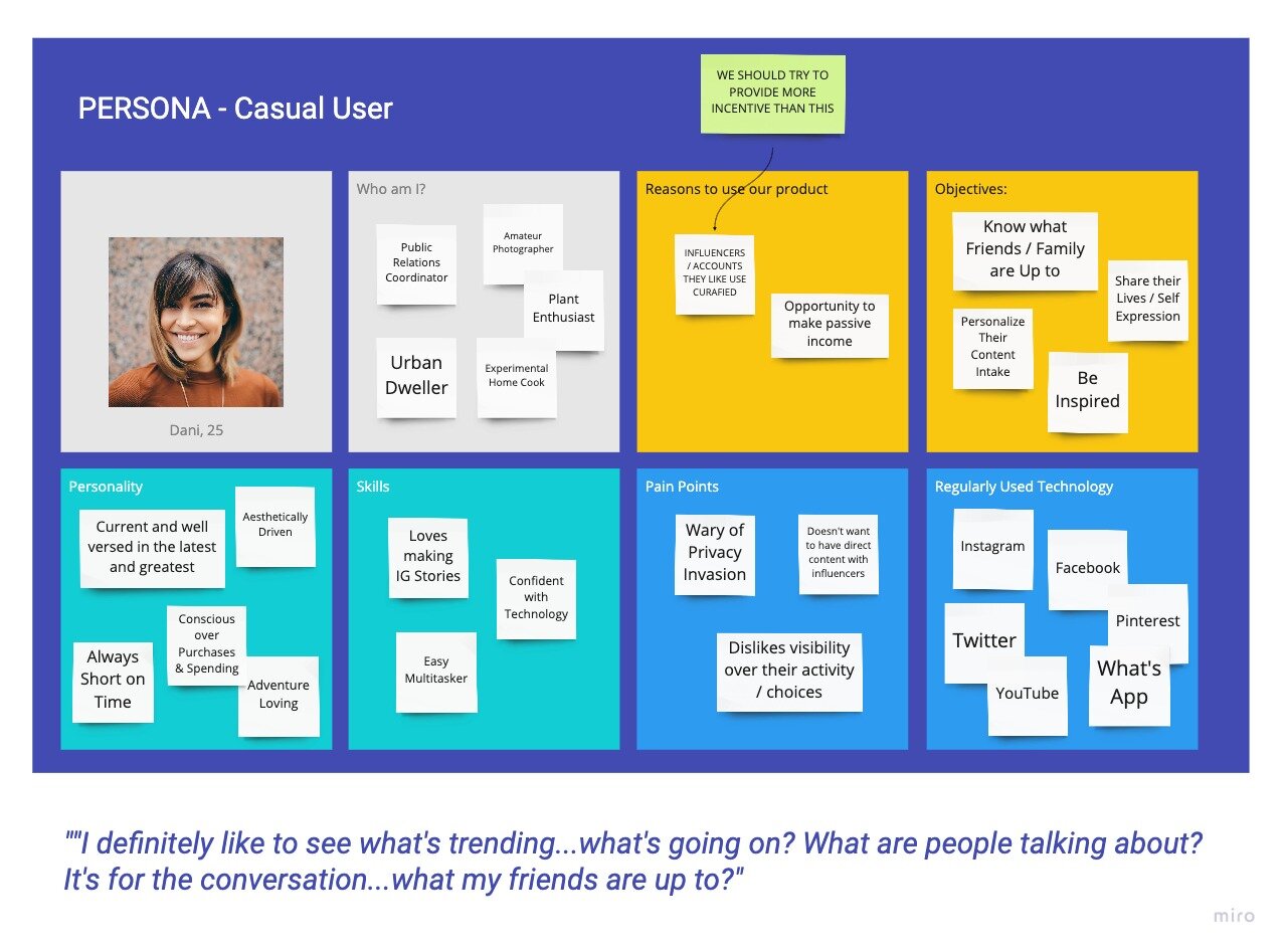
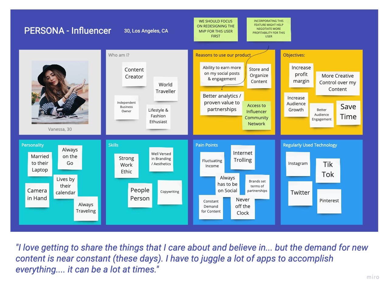
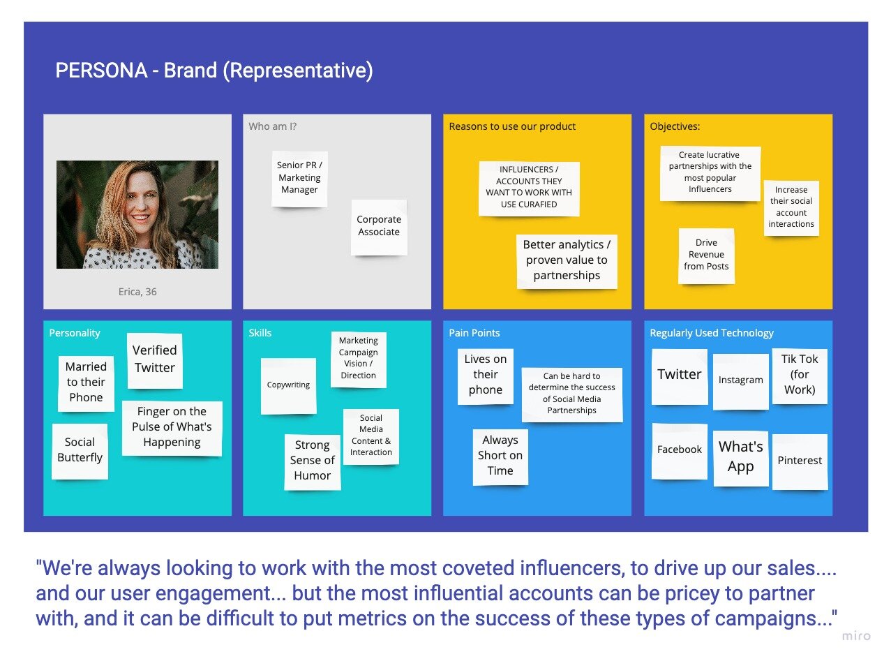
I deducted that Curafied had three potential personas, the wide reaching Influencer, Casual Users and Businesses (or their PR agents). The first two personas, Influencer and the Casual User were my top priorities to understand. Influencers were necessary for the business concept to function, and Casual Users needed to be invested enough in their favorite accounts to migrate over to a paid subscription for something that they had been receiving for free.
Due to start up financial constraints, we were unable to interview Influencers or Corporate PR reps, but I was able to reach out to members of the general audience base to get a feel for how their wants / needs held up against Curafied’s preconceived notions.
The below criteria was used to recruit potential interviewees:
Participant parameters:
18-45 years old
$40,000-$150,000 Annual Salary
Full Time Employed / Self Employed / Full Time Student / Homemaker
USA
Uses Facebook, Twitter, Instagram
DISCUSSION GUIDE:
In order to maximize what we could learn, I wanted to interview users about their social media habits and relationships, how they felt regarding Influencers, Social Media as a whole and what tools / apps they were currently using.
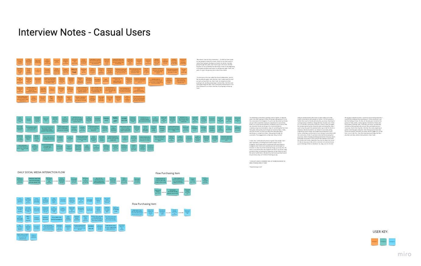
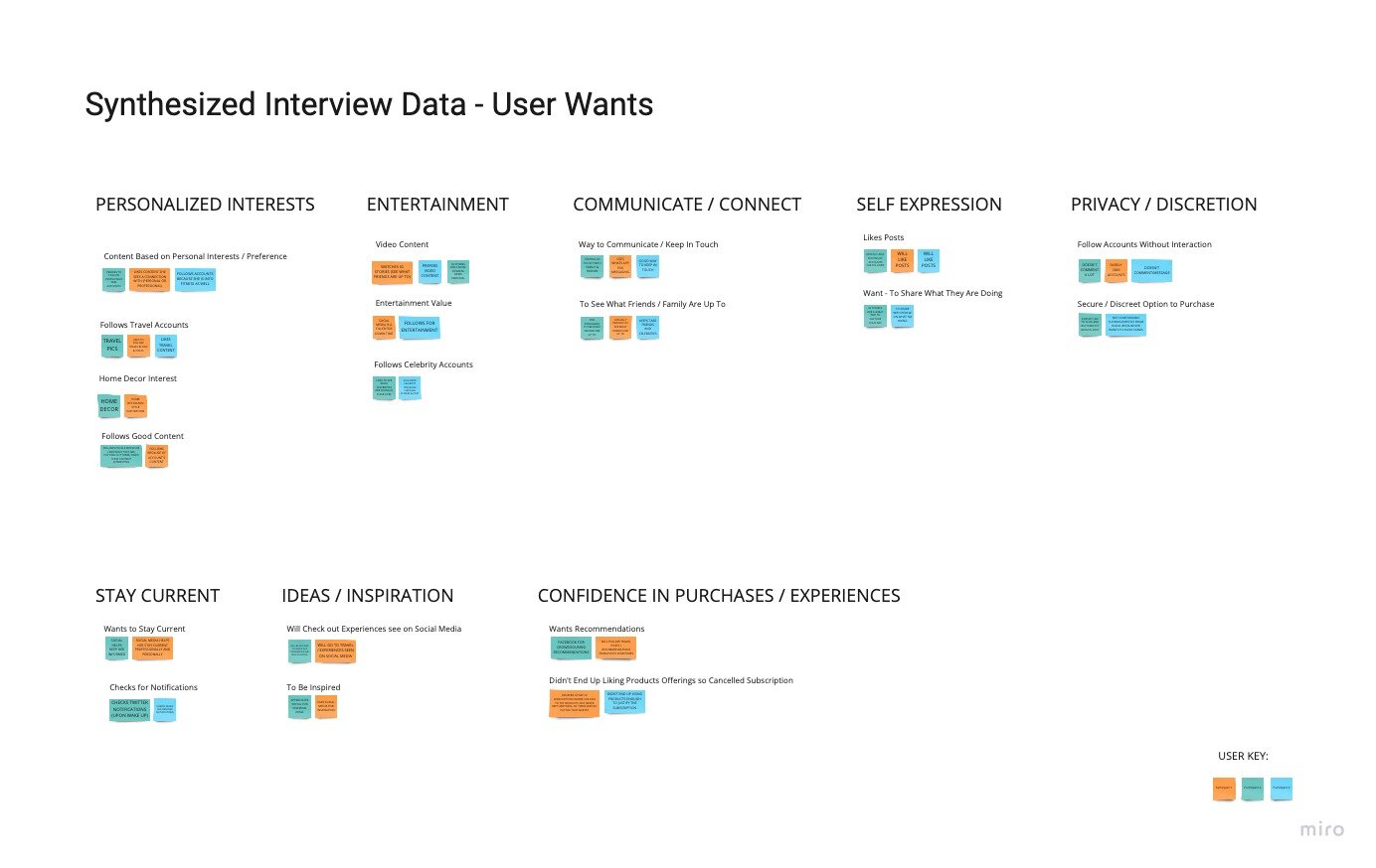
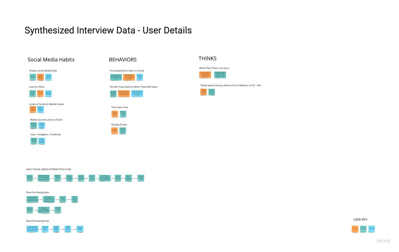
I wrote up a guide here that would help me stay on track to gain user insights without influencing the interviews. After interviews were completed, I used affinity mapping techniques to deduct the following conclusions:
CASUAL USER TAKEAWAYS:
Social media is a way to keep up with personal interests.
Users enjoy the entertainment value, especially videos.
They use it to stay connected with loved ones.
It is an outlet for their self expression.
They prefer interactions to remain under the radar (i.e. They will like, but won’t comment on posts.)
Products are primarily used on mobile devices.
They do purchase items they see on social media.
Users are interested in subscription plans when they can perceive the added value.
*Close ups and details of the affinity maps below can be found here.
““(I love that) I can just leave a comment and let someone know that I am thinking about them”
”
““(My) Blue Apron (subscription) I love for the convenience. ... It’s $60 for three meals for two people to have $10 a meal. I think for me, that’s worth it rather than having to like figure out what’s for dinner.””
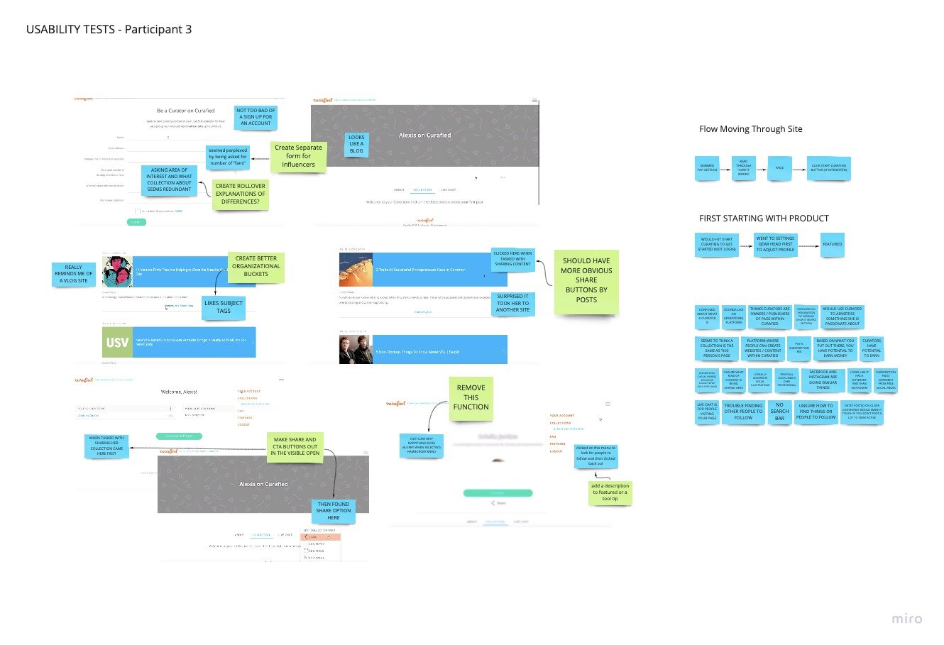
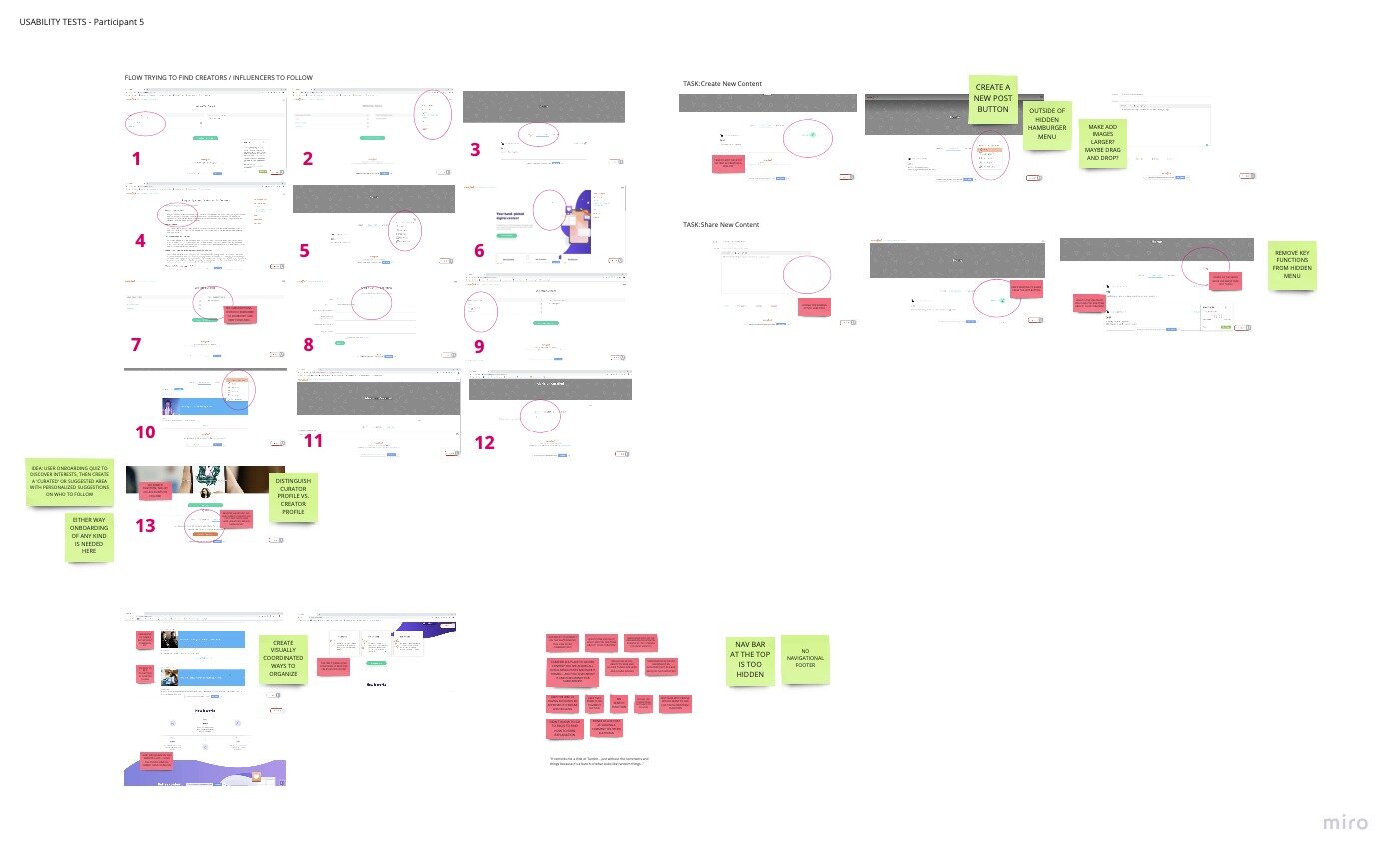
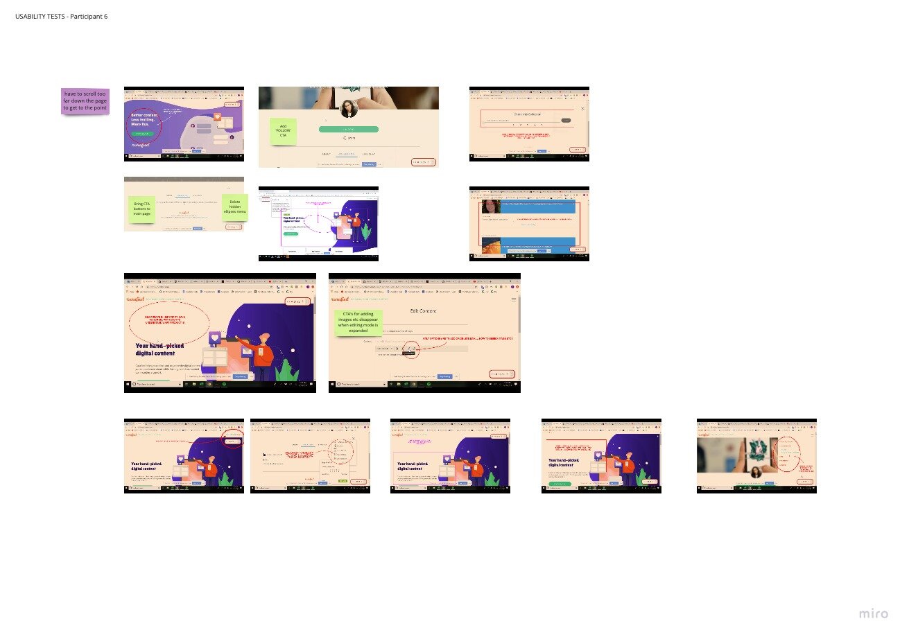
USABILITY TESTS:
Since Curafied already had an existing MVP, once interviews were completed, I decided to also run user tests to find out if the existing product successfully delivered on any of the key components below:
Do Users understand what Curafied is?
Are Users able to find and follow influencers?
Are Users able to create and share content?
Do Users understand how to earn money with Curafied?
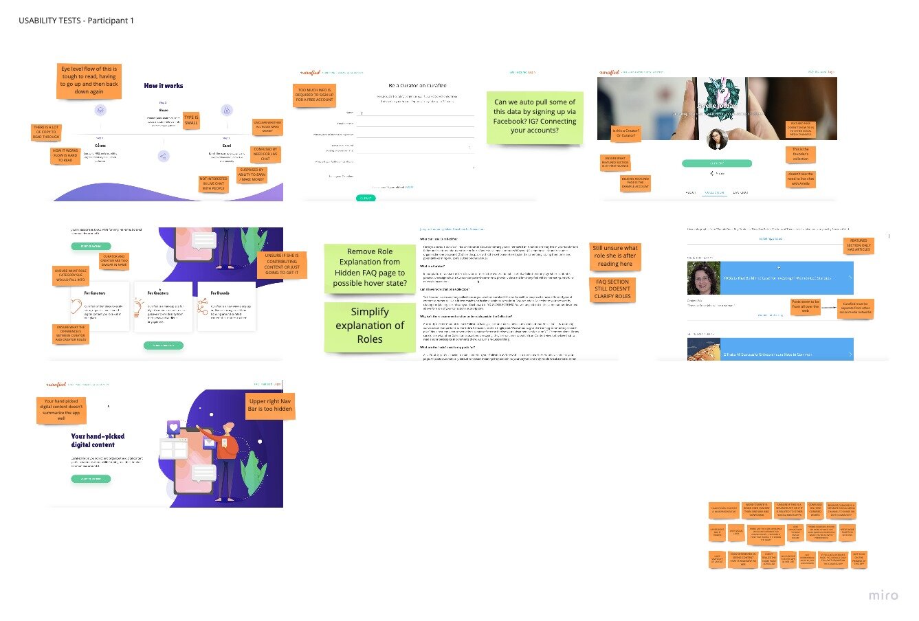
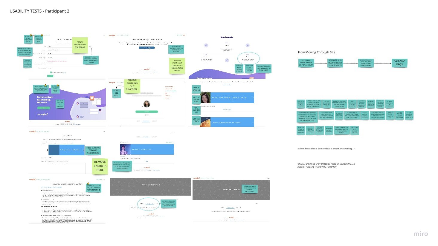
The full discussion guide and research plan can be found here, full detail of the research artifacts below can be found here.
KEY findings:
Overall the product gave a good visual impression, but users really struggled with understanding the key functions and value or purpose of Curafied. Most participants were confused about main concepts such as how Curafied could be used to earn income… or what the differences were between user roles.
The MVP itself was very difficult for users to use. When testing the key functions, Users often got frustrated and were unable to complete their tasks.
The following were recurring observations:
(+)
Sign up was easy and clear.
Users would use Curafied as a tool to collect and save content.
Visual Design was well received.
Users were surprised, but intrigued about the ability to earn money.
(△)
71% of users were unclear what the product was right away.
In 2/3 of the core functions, more than half of users were unable to complete their given task.
Overall clarity and usability are big issues.
Users are confused over Curafied’s key product purpose and value, and correspondingly unclear on its’ core functions and concepts
*See more details about data below here.
““I appreciate the effort to make this look (visually) very simple. The layout is good in that way, but I think the actual content of each section needs to be said more clearly.” ”
““It reminds me of Tumblr, but without the comments... because it looks like a bunch of random things””
NEXT StEPS:
In conclusion, it seems that there are some glaring issues with the premise of Curafied that might warrant a careful reconsideration of the main business plan.
It would be my recommendation for Curafied stakeholders to pivot in their focus based on the findings in this report. If they do make the decision to follow this lead, I would recommend the following as important next steps in furthering investigations.
Completed User Personas (I created some here, based on the research conducted in this study and internet research. Further research should be conducted to update accuracy on the Influencer and Brand personas).
Completed Users Flows for all main actions and all personas.
C&C Analysis
Feature Prioritization
Redesign main ‘Featured’ Page based on accurate Personas and User Flows
User Onboarding
IMMEDIATE IMPROVEMENTS
Since financial and circumstantial constraints may not permit a full business pivot, smaller and more immediate UI suggestions can be found in the chart above. Specific User call outs correspond with proposed design solutions in the column to the far right.
A full embedded copy of the entire UX audit is available below.


